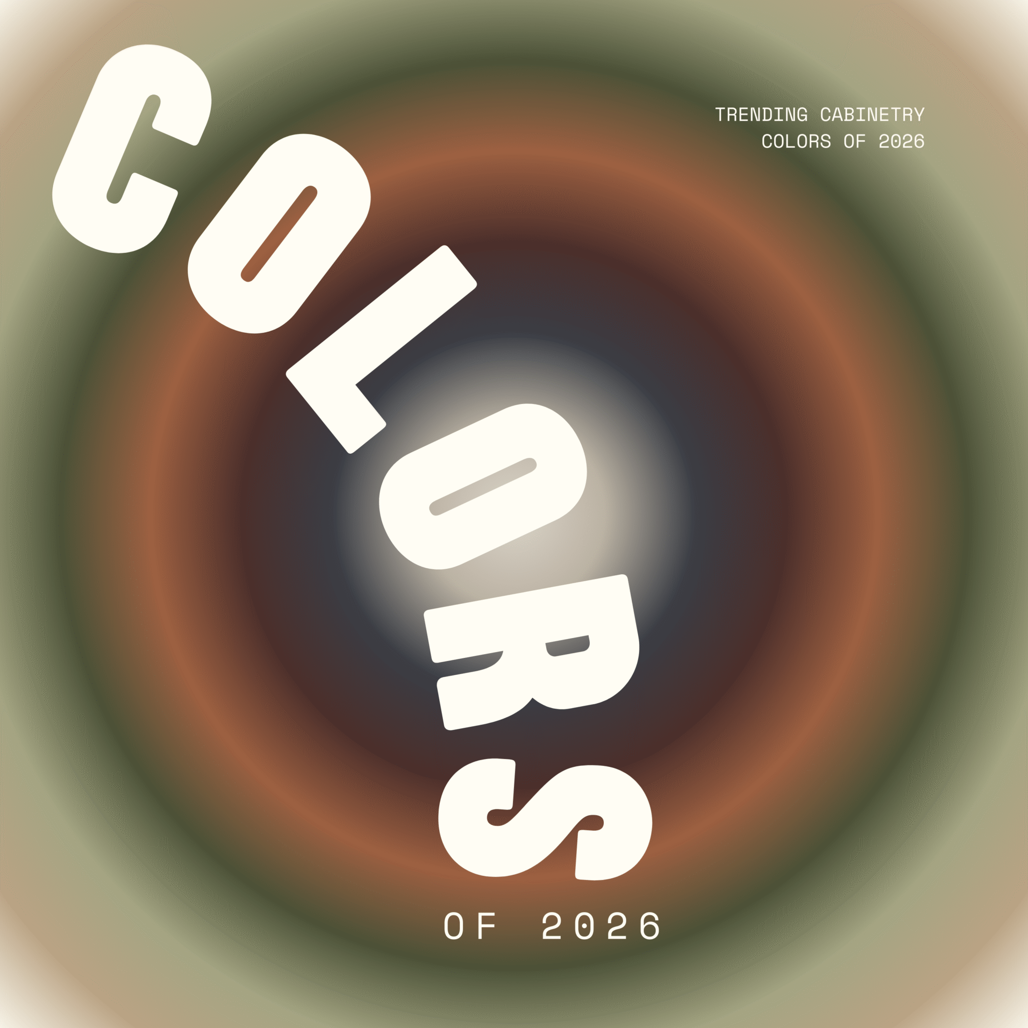
The Colors of 2026
This Years Trending Cabinetry Colors
The 2026 signature cabinetry palette reflects a shift toward depth, nuance, and material-driven color. Instead of stark contrasts or fleeting trends, this collection focuses on tones that feel grounded in nature and architecture—colors shaped by stone, soil, foliage, and mineral pigments.
As a whole, the palette is cohesive and highly livable, designed to layer seamlessly within a home. Each hue carries subtle complexity, allowing cabinetry to feel integrated with its surroundings rather than applied on top of them. The result is a range that supports both statement moments and restrained, timeless spaces—where color works in harmony with wood, metal, and stone to create lasting interiors.
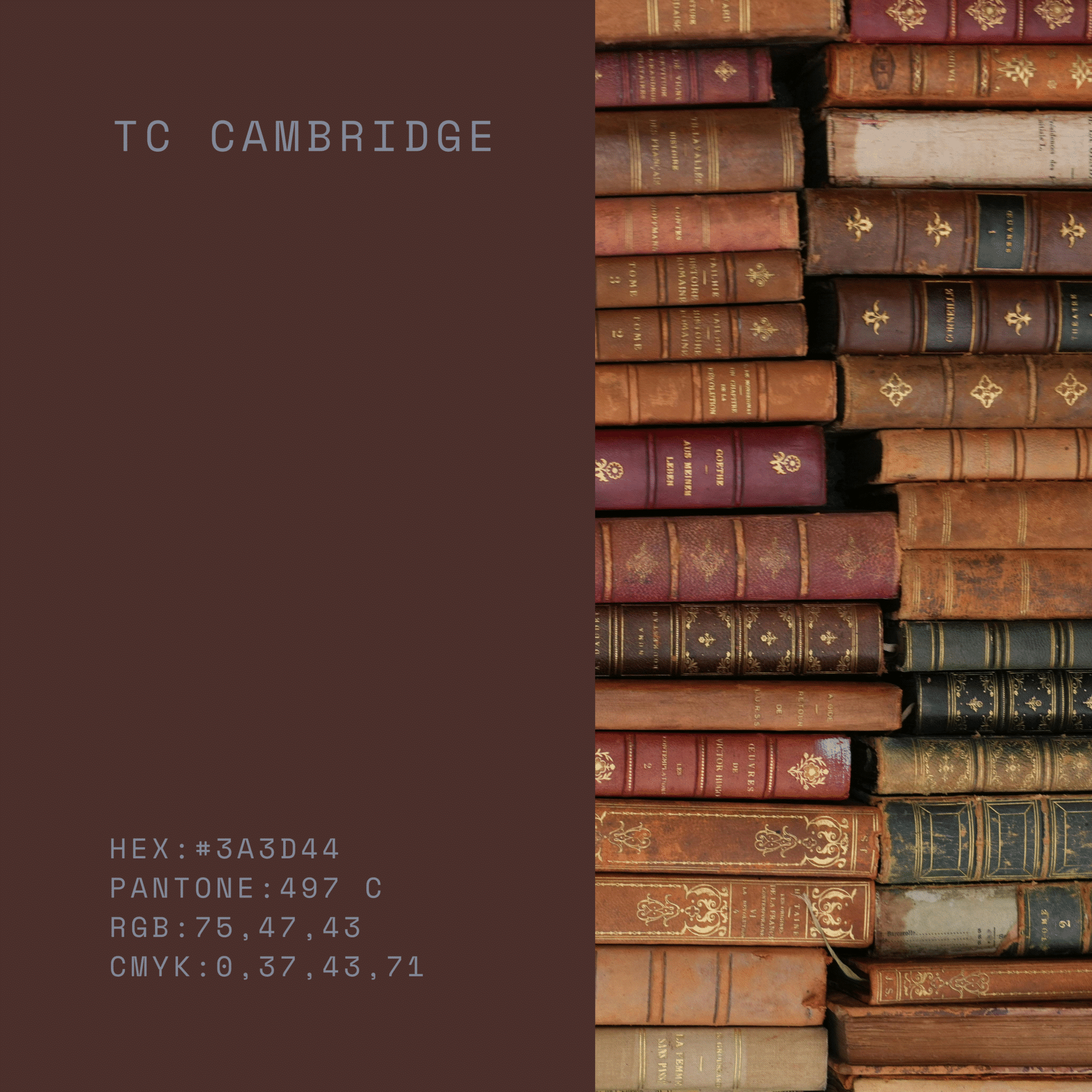
Cambridge
Cambridge is a deep, heritage brown with subtle red undertones that evoke leather, walnut, and aged woodwork. It brings a sense of tradition and substance to cabinetry, lending warmth and gravitas to a space. Especially striking with brass, natural stone, and creamy neutrals, it delivers a refined, classic foundation.
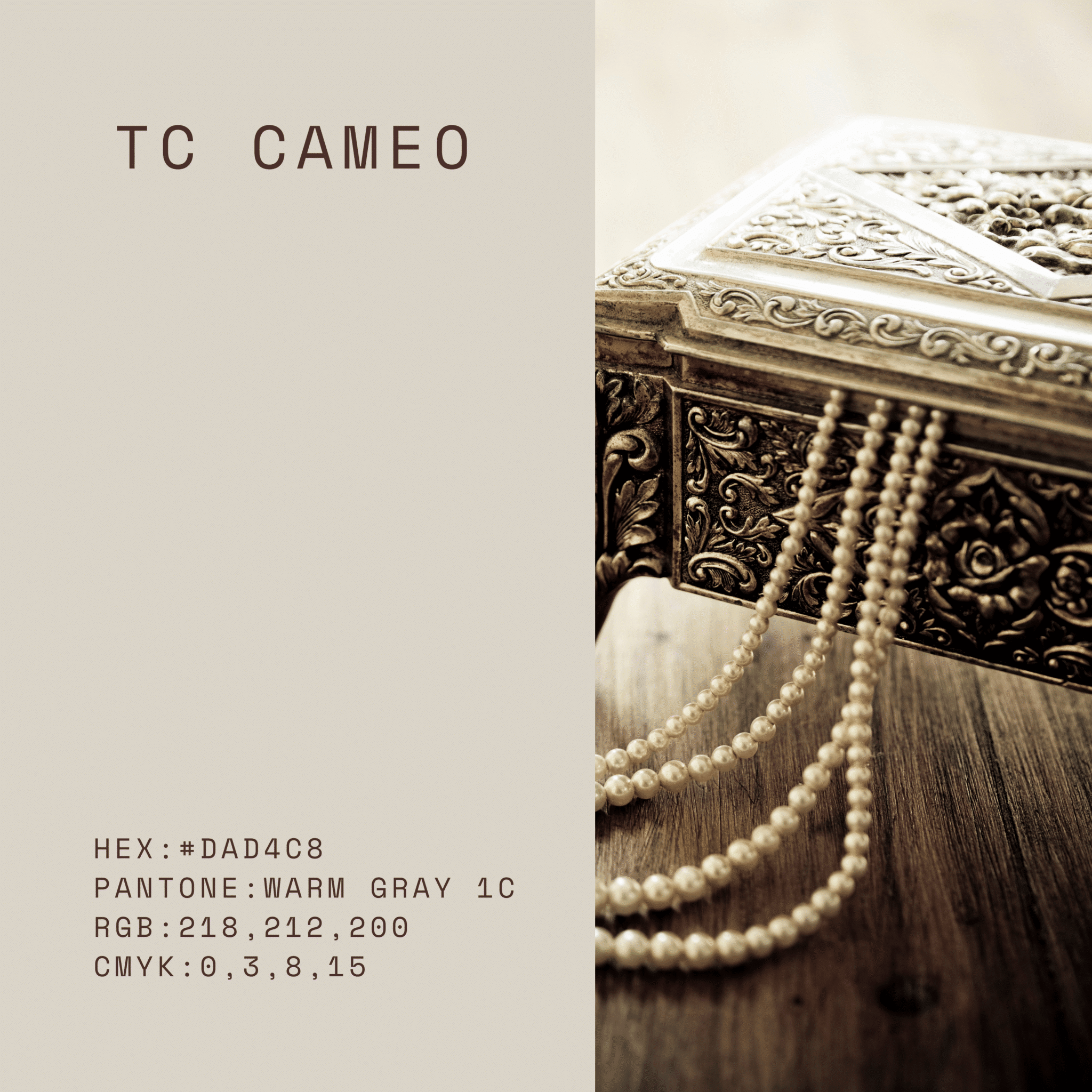
Cameo
Cameo is a soft, warm neutral that sits between cream and pale beige. Its gentle warmth brightens cabinetry without feeling stark, making it a versatile backdrop for both natural wood tones and richer accent colors. It lends a light, welcoming atmosphere while still feeling tailored and refined.
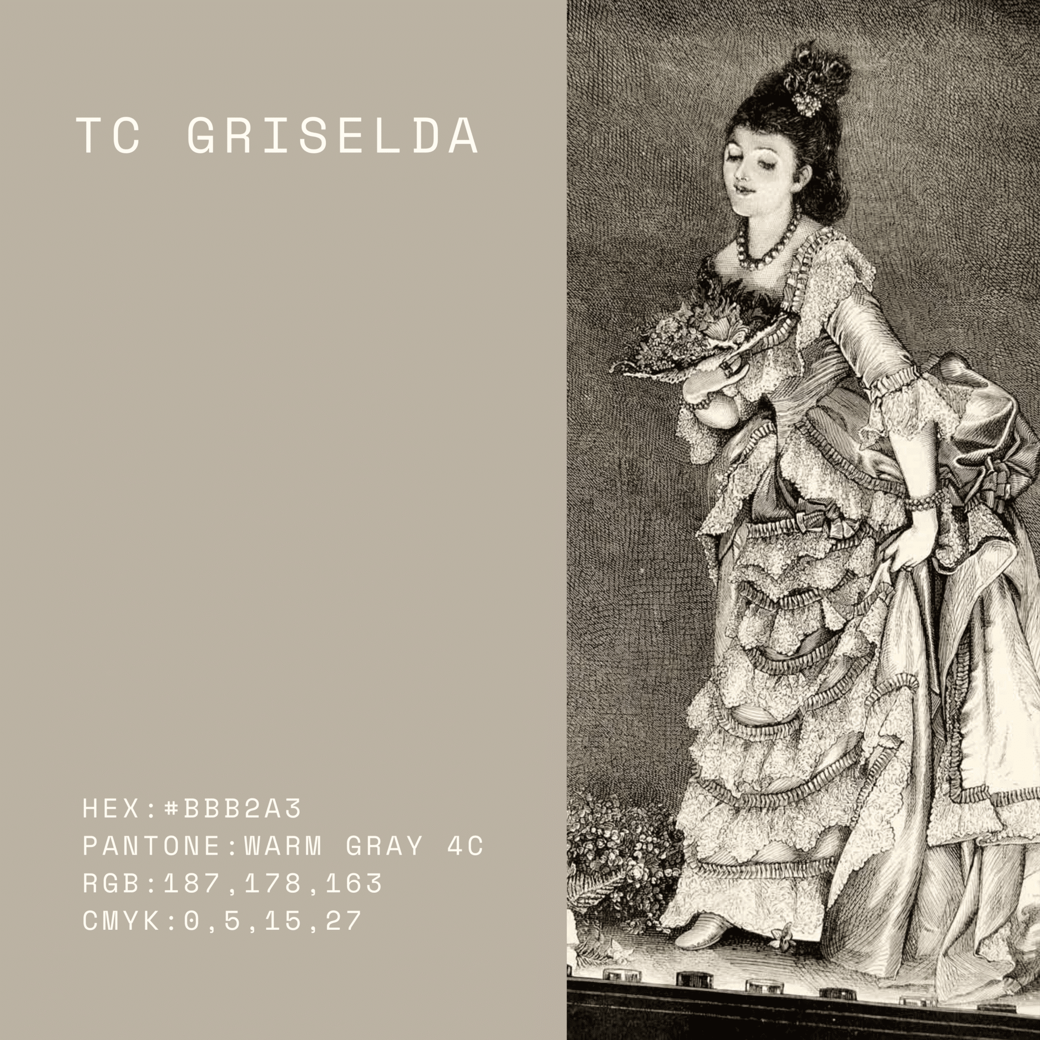
Griselda
Griselda is a refined mid-tone grey with balanced warmth, avoiding both cool sharpness and heaviness. Its subtle depth gives cabinetry a tailored, architectural presence while remaining highly versatile. It works effortlessly with marble, brushed metals, and layered neutrals for a composed, timeless look.
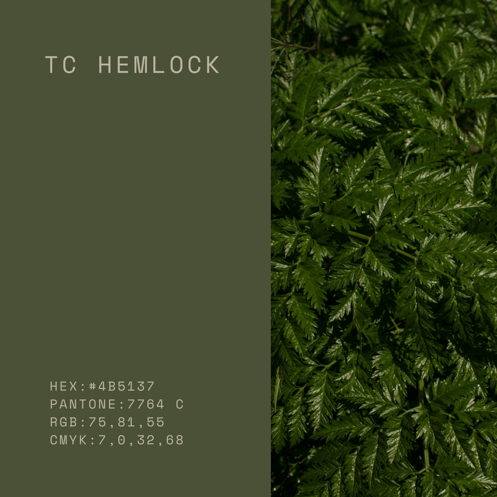
Hemlock
Hemlock is a muted, earthy green with subtle grey undertones. It draws from foliage and forest tones, giving cabinetry a natural, grounded character. Versatile and calming, it pairs beautifully with wood grains, stone, and warm metallic finishes.
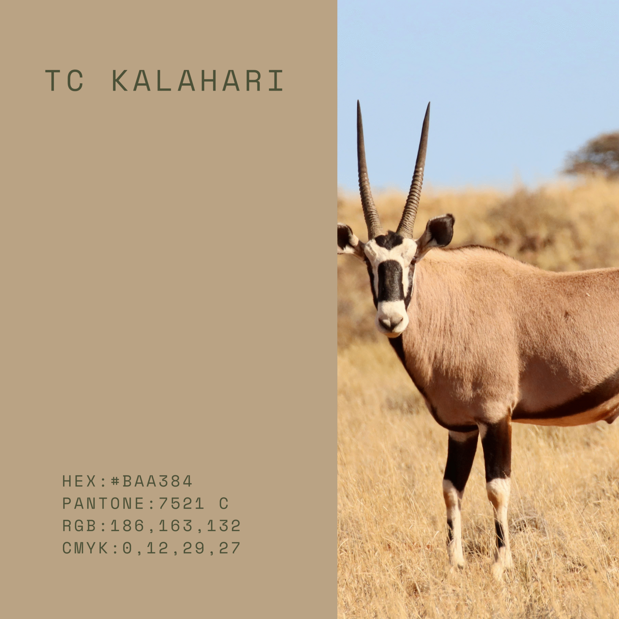
Kalahari
Kalahari is a warm sand-toned neutral with sunbaked depth. It echoes natural clay and limestone, bringing an organic warmth to cabinetry. This hue layers effortlessly with wood, stone, and textured finishes for a relaxed but refined feel.
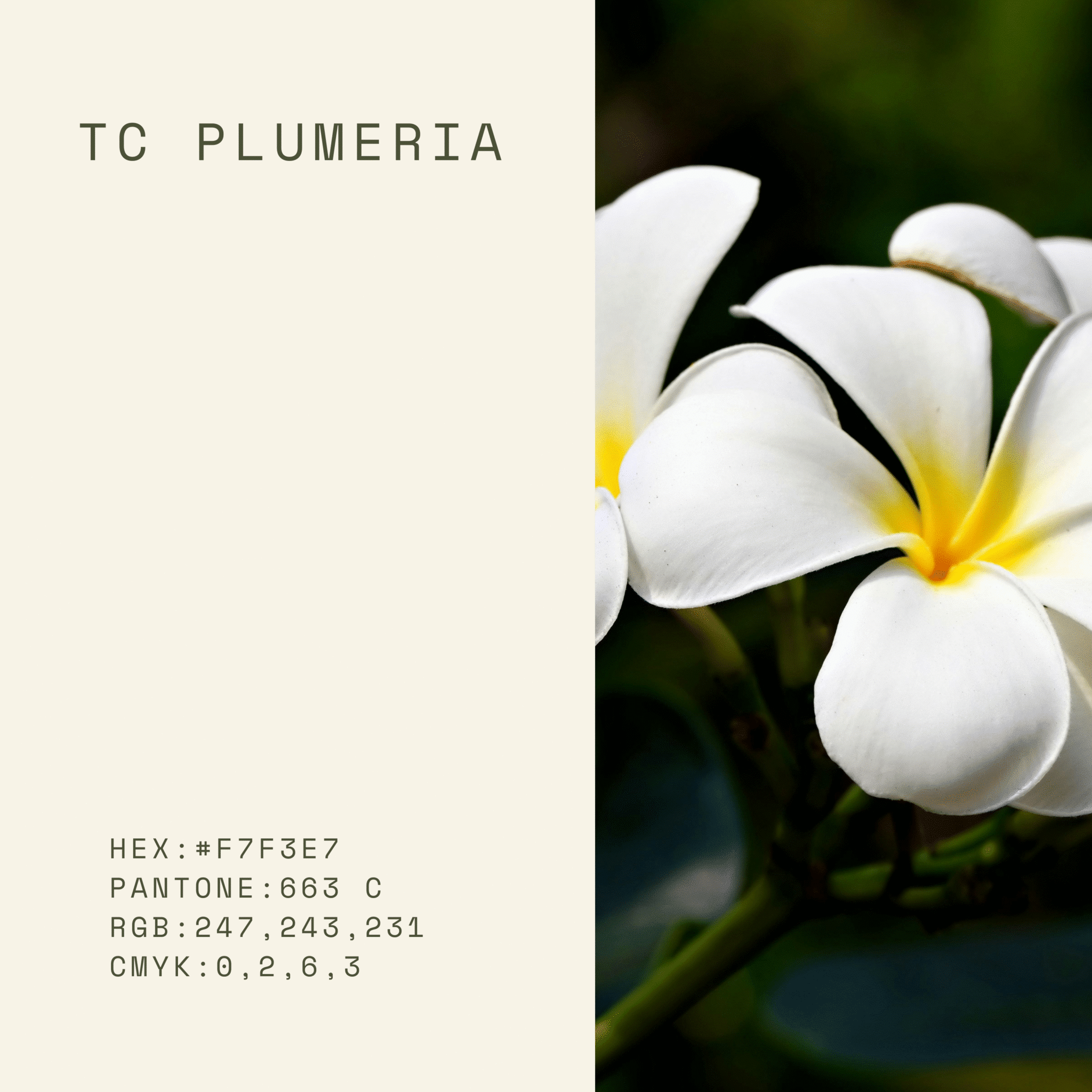
Plumeria
Plumeria is a soft, blush-leaning neutral with a gentle warmth. Its subtle rosy undertone adds dimension without reading overtly pink, giving cabinetry a fresh yet sophisticated character. It pairs especially well with warm metals, creamy stones, and natural wood tones.
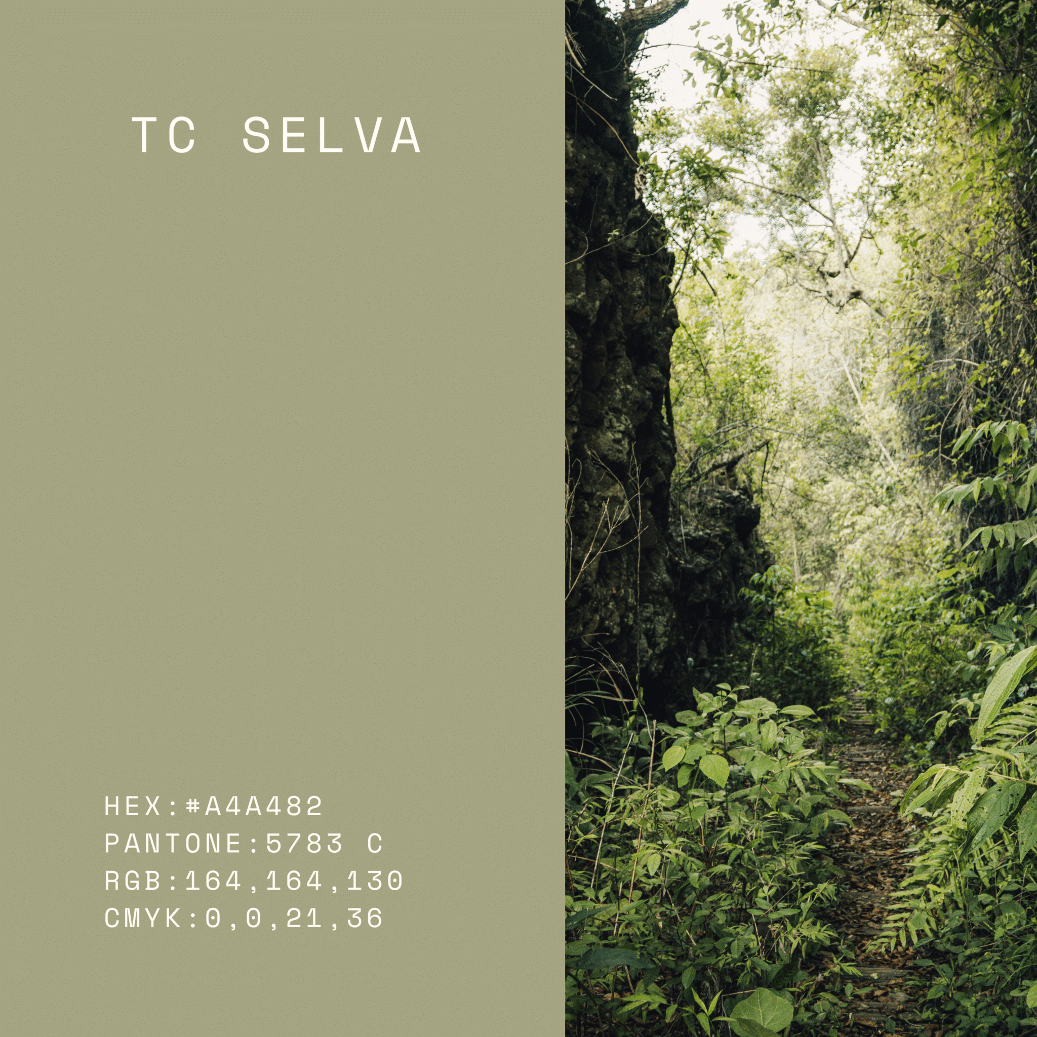
Selva
Selva is a deep, foliage-inspired green with rich, natural depth. It brings a lush, enveloping quality to cabinetry, offering color that feels both organic and elevated. Beautiful alongside wood tones, stone, and brass, it creates a layered, nature-driven palette.
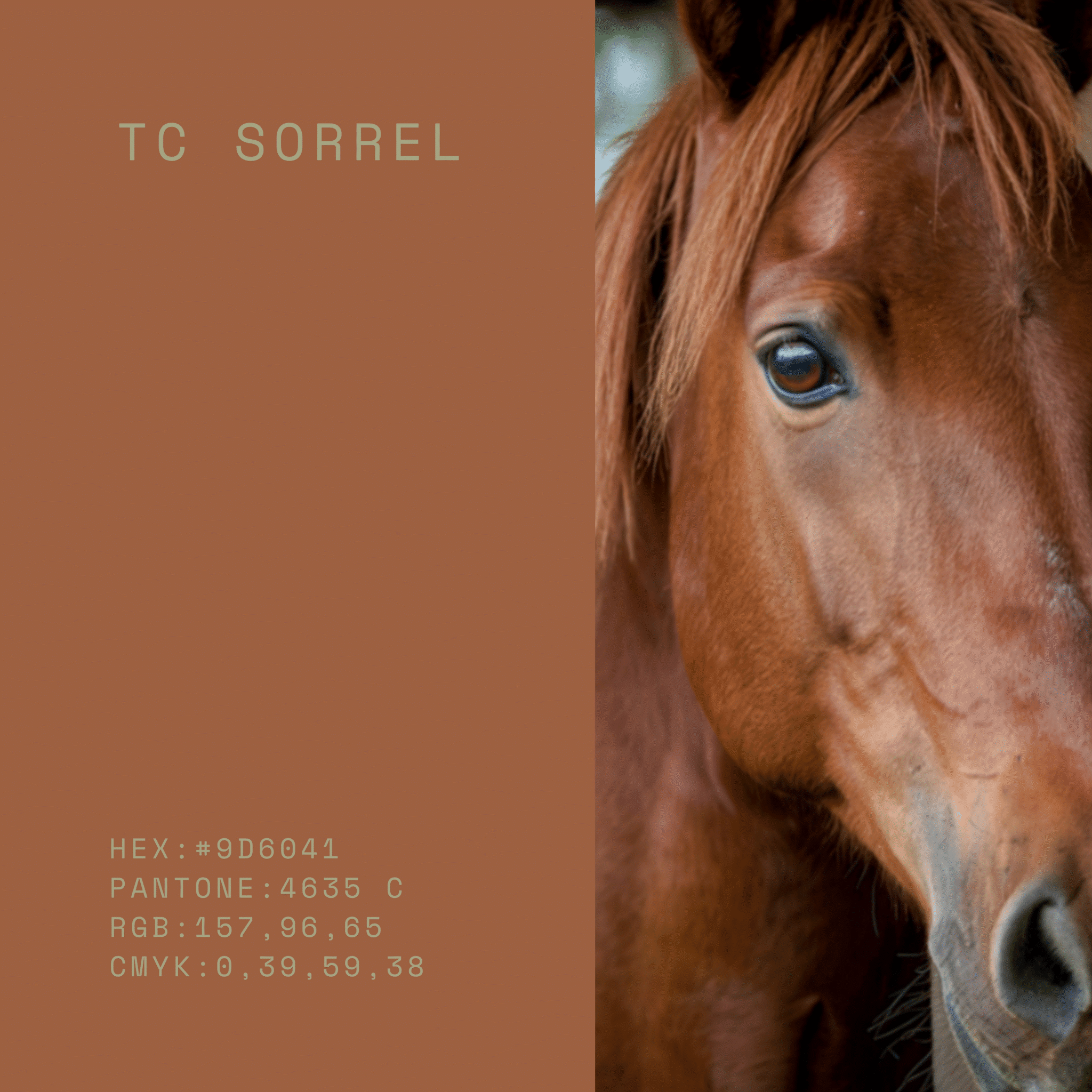
Sorrel
Sorrel is a warm, brown-leaning neutral with subtle reddish undertones. It recalls saddle leather and natural earth pigments, giving cabinetry a sense of warmth and maturity. It pairs beautifully with stone, textured finishes, and aged metals for a grounded, inviting look.
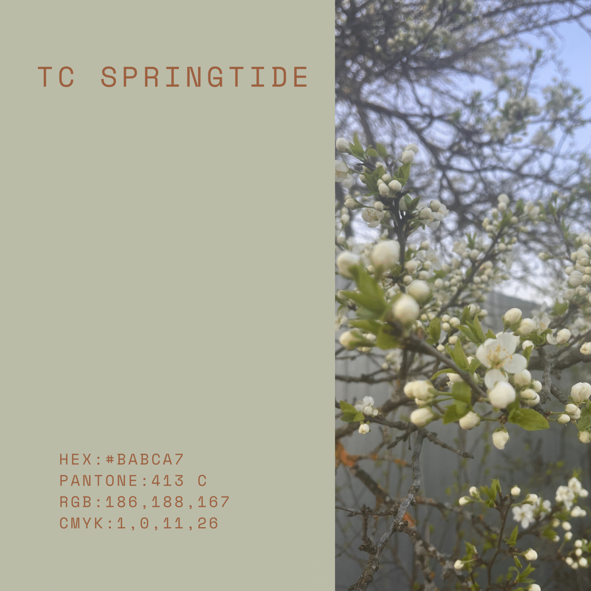
Springtide
Sprintide is a light, airy neutral with a soft green-grey cast. It feels fresh without being crisp, offering a gentle lift to a space while maintaining a natural, subdued character. Ideal for brightening cabinetry in a way that still feels grounded and cohesive with organic materials.
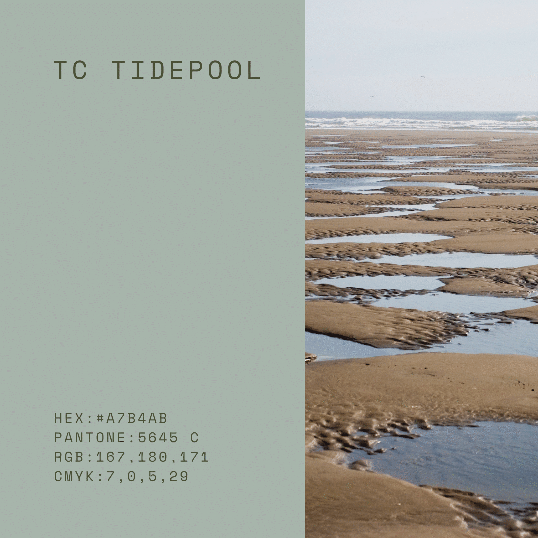
Tidepool
Tidepool is a blue-green that sits between coastal and mineral tones. Its balanced depth brings color without overwhelming, giving cabinetry a composed, nature-inspired presence. It pairs well with pale woods, stone, and warm metals for a layered, coastal-leaning palette.
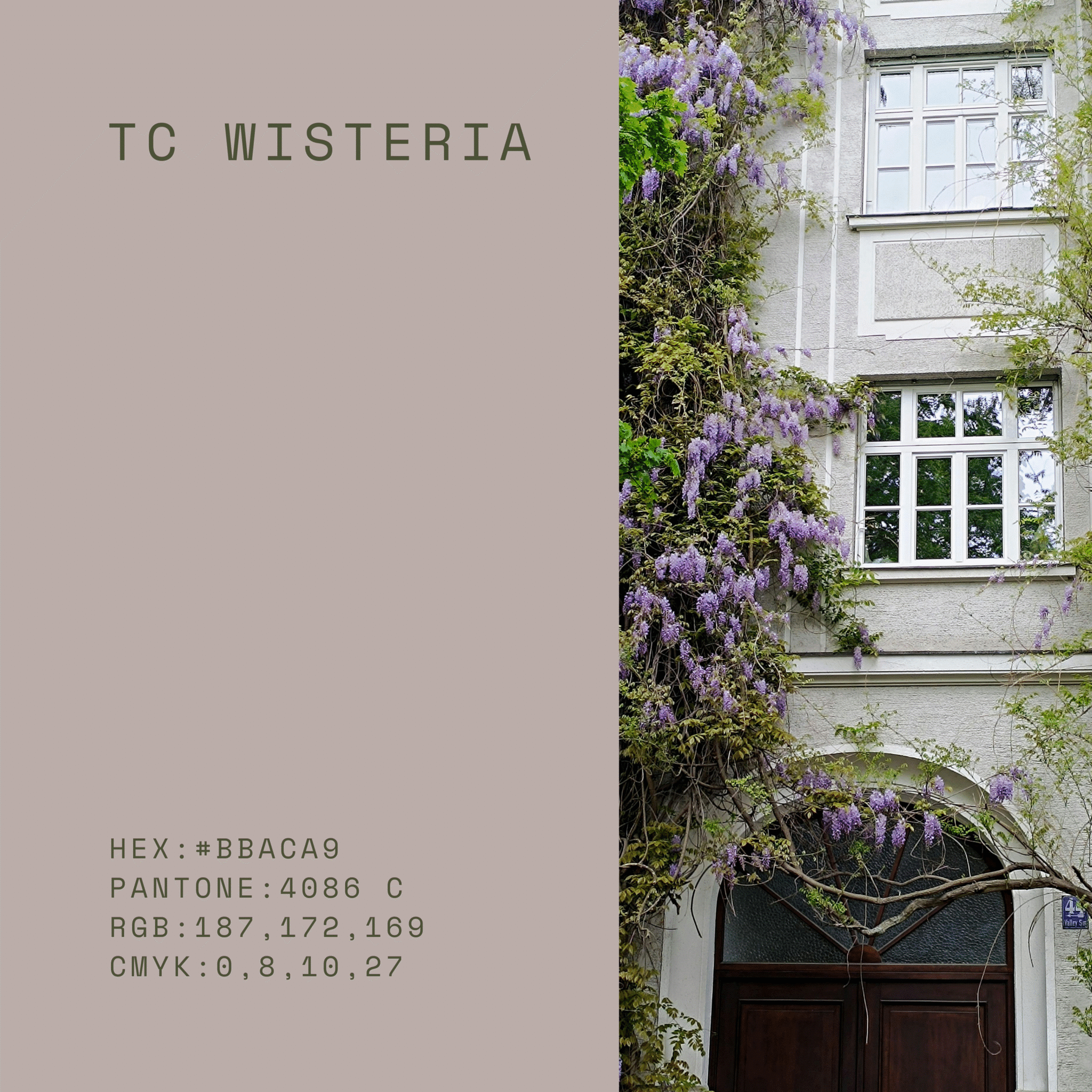
Wisteria
Wisteria is a softened grey with a hint of violet undertone. This subtle complexity adds dimension while still reading as a neutral. It offers a refined, modern feel and works beautifully with cool stones, light woods, and brushed metal finishes.
Ready to style a trending cabinetry color in your kitchen?
Choosing a cabinetry color isn’t just picking a favorite swatch—it’s choosing the foundation your kitchen will live on for years. Our team guides you through a deliberate, design-led process that considers far more than the color itself: your home’s architecture, natural light, adjoining finishes, stone movement, wood tone, hardware, and the overall mood you want the space to hold.
We review your selections in context, compare undertones side by side, and refine the palette until it feels cohesive, balanced, and undeniably “you.” The result is a kitchen that looks beautiful on day one—and still feels right a decade from now: timeless, considered, and built with intention.
Reach out today to start planning your design
- Category :
- Type :