
The truth about color choices
Color is one of the most powerful tools in design—and one of the most misunderstood. A fresh coat of paint can completely transform a space, yet many homeowners make choices based on long-held myths or quick online inspiration. At Red House Design Build, we’ve guided countless clients through this exact process, helping them select hues that enhance light, material, and mood rather than fight against them.
Let’s debunk some of the most common myths about paint and color so your next project starts—and ends—on the right shade.
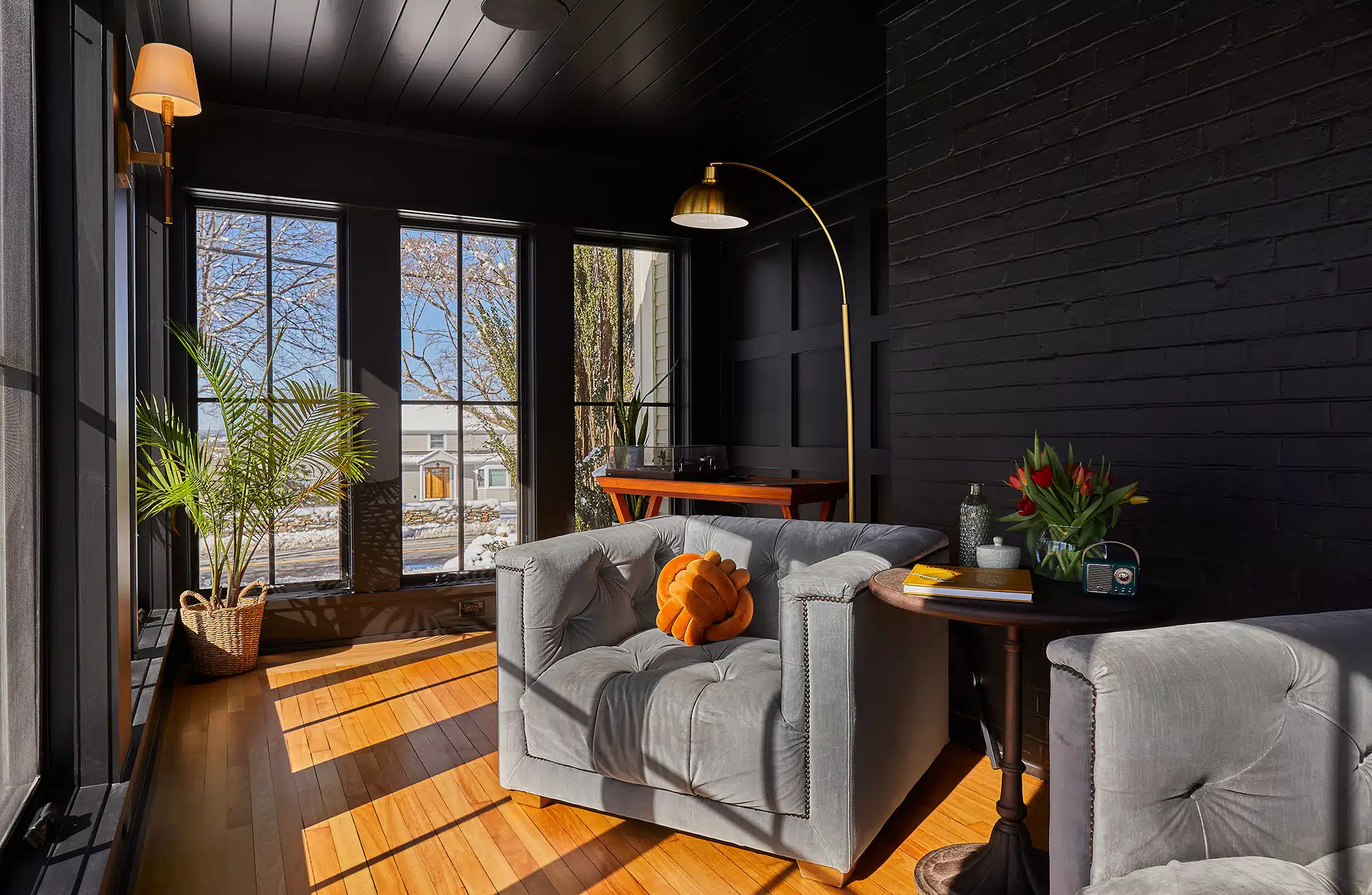
Myth: Ceilings Should Always Be White
The truth:
This “rule” comes from builder-grade simplicity, not design science. Painting ceilings a soft tint of the wall color—or even wallpaper—can add sophistication and atmosphere.
Tip:
Try a tonal ceiling (10–20% lighter or darker than the wall) for subtle enclosure, or paint it the same color for an enveloping, gallery-like effect.
Myth: White paint always makes a room feel larger
The truth:
White can enhance a sense of space—but only when paired with balanced light and texture. In low-light rooms, stark white can actually feel flat or cold, emphasizing shadows rather than brightness. Sometimes, a mid-tone neutral or soft color adds more depth and dimension. The night sky doesn’t feel so tiny, does it?
Tip:
Choose paint based on light quality, not room size. South-facing rooms handle cooler whites beautifully, while north-facing spaces benefit from warmer, creamier tones.
Read this article for tips on warming up a classic white kitchen.
Myth: Dark Colors Make Rooms Feel Smaller
The truth:
Depth, not darkness, defines perception. Dark walls can actually expand a space visually by creating contrast and pushing boundaries outward. In well-lit rooms, deep colors add drama and coziness without closing in the space.
Tip:
Pair bold colors with ample lighting and contrast—like a lighter shade trim, warm metallics, or soft textiles—to balance mood and proportion.
You Should Pick Your Paint Color First
The truth:
Choosing paint first is one of the biggest design missteps homeowners make. In fact, nearly 40% of paint sold in the U.S. is used to fix previous color mistakes. Paint color should always be chosen last—after flooring, cabinetry, tile, and fabrics are finalized. Every surface in a room affects how color reads, from lighting and sheen to undertones in wood and stone. Since paint can be mixed into virtually any shade, it’s far easier to match the walls to your materials than the other way around.
Tip:
Treat paint as the finishing touch, not the foundation. Once your finishes and furnishings are in place, you’ll see how natural light interacts with them—allowing you to select a paint color that truly complements the space. If you must paint before furnishing (as in a new move-in), stick to flexible neutrals like warm white, soft greige, or pale taupe that adapt easily to a range of tones and textures.
What about adding color in other ways? Read this article for ideas on adding color to your kitchen.
Neutrals Are Always the Safe Choice
The truth:
Neutrals can be deceptively tricky. Undertones vary—some lean pink, yellow, green, or blue—and can clash with fixed finishes. The safest neutral is the one that harmonizes with the room’s materials and light.
Tip:
Test large swatches on multiple walls and observe them morning to evening. A neutral that looks beige at noon may read gray by dusk.
Read this article to learn more about how colors change in different light conditions.
All Rooms Should Share the Same Color Palette
The truth:
Consistency matters, but uniformity doesn’t. A home should flow, not repeat. Coordinated undertones across varied hues create visual interest while maintaining harmony.
Tip:
Build your palette around one anchor tone—like warm oak flooring or a recurring trim color—and let each room explore its own personality within that framework.
Paint Is the Final Brushstroke, Not the Blueprint
Color is one of the simplest ways to transform a space, but also one of the most personal. The key is understanding that paint should respond to your home’s light, materials, and energy—not lead them.
At Red House Design Build, we help clients select colors that belong—to the house, the light, and the people who live there. Because when all the elements work in harmony, color becomes the finishing note that makes a space sing.
Ready to reimagine your home in color?
Let’s get started today on telling your home’s color story